|
 The main purpose of the Calendar component is to present a month (or a set of months) in a user-friendly way as a table of the calendar’s days and to allow the user to easily select desired date. The main purpose of the Calendar component is to present a month (or a set of months) in a user-friendly way as a table of the calendar’s days and to allow the user to easily select desired date.
Basic Features
In the calendar’s day table view, each Calendar’s column has an associated caption displaying the weekday. Each Calendar’s row shows one whole week of weekdays. Previous and next month’s days can also be shown in the Calendar. Presentation of the off-month days and their navigation are optional and can be disabled either at design or at run time.
Navigation within the Calendar accomplished by any of the following methods:
- Keyboard’s arrows, [Shift+] Tab to navigate one day
- Home/End buttons to select First/Last day of current month
- Mouse click to select any visible day
- Mouse wheel to navigate by month. In combination with Ctrl button
you can
navigate by year, with Shift button – by week
- Page Up/Page Down buttons to navigate by month. In combination with Ctrl button it will navigate by year, with Shift button – by week
- Using special Calendar navigation buttons allows navigation by week, month and year (depending on Calendar’s type)
When off-month day is selected, the Calendar is switched to the next/previous month (depending on the selected day) and selected day is highlighted.
The Calendar is locale-dependent. Some tool tips, text, days and weekday names and their order depend on the selected locale. For example for US locale Sunday will be first day of the week, for Russian locale it will be last.
There are some general Calendar properties which can be changed from their default values.
- Locale – allows displaying Calendar in a manner appropriate to current or selected locale, for example weekday names and their order, or date format for the Date Field.
- Short Day Caption – shows only first letter of the weekday’s name
- Show Grid – shows grid dividing Calendar days
- Show Vertical Lines – shows vertical lines dividing days of the week
- Show Horizontal Lines - shows horizontal lines dividing weeks
- Show Off-month Days – shows off-month days
- Allow Selection Off-month Days – allows selection of off-month days
- Preserve Current Day – if Allow Selection Off-month Days is disabled and off-month day is selected by mouse or keyboard, new selection will be refused and restored to the previous one if preserve, otherwise the nearest day of current month is selected (in case of next month - last day of the month, in case of previous month - first day of the month)
- Foreground – foreground color (only for current month weekday days)
- Background – background color
- Header Foreground – week day names foreground color
- Weekend Foreground – weekend foreground color
- Weekend Background – weekend background color
- Off-month Weekday Foreground – off-month weekday foreground color
- Off-month Weekday Background – off-month weekday background color
- Off-month Weekend Foreground - off-month weekend foreground color
- Off-month Weekend Background - off-month weekend background color
- Today Border Color – today’s border color
- Today Border Thickness - today’s border thickness
Each Calendar day can be pictured in a different way, depending on the user’s needs, by manipulating required day’s properties such as Font Style (Bold or/and Italic, Plain), Border, Foreground, Background, Icon, Tool Tip Text , etc..
There are 3 types of Calendar and Date Fields as described below.
Simple Month Calendar
Simple Month Calendar represents a month calendar with navigation by keyboard and mouse only.
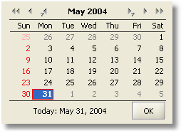
Month Calendar with Navigation
Month Calendar with Navigation extends Simple Month Calendar by adding two decorative panels on the top and bottom of the Calendar. By default they are Navigation Panel on the top of the Calendar and Control Panel on the bottom. Both of them can be replaced be custom panels or deleted completely.
The Navigation Panel shows selected month and year in the format of the given locale. There are six navigation buttons assembled into two groups which allow navigating through the Calendar. Users have the ability to navigate by week, by month or by year. Each navigation button can be hidden.
The Control Panel contains two control buttons. The first button shows today’s date in the format of the given locale. By clicking on this button, the Calendar will be set to today’s date (based on the system date). A second button, titled “OK”, generates an event showing that the date is selected. Each control button can be hidden.
Multiple Month Calendar
Multiple Month Calendar is similar to Month Calendar with Navigation, but allows showing as many months as required. The number of months and rows can be specified. This can be very useful if the user needs to view a quarter or a whole year. Months in the Calendar can be arranged in a vertical/horizontal line or in the grid by manipulating two properties - Calendar Amount and Rows. First month specifies the initial starting Month of the Multi Month Calendar Component. For example, if Calendar is required to show a whole year, January should specified as a first month.
Date Field with Popup Month Calendar
Date Field with Popup Month Calendar represents a field to show, enter and validate the date. The Date Field consists of the Text Field to show/enter the date and the Button to popup the Month Calendar with Navigation. The Month Calendar with Navigation can be presented by pressing Down the Arrow key on the keyboard (note – this can be redefined). Using the popup calendar allows for the selection of a particular date rather than typing it. The text, tool tip and icon for the Button can be changed as well.
Date format depends on the given locale. Year digits amount can be changed to show two or four digits. Entered dates will be validated against specified locale. Date Field Component validates that the month should be between 1 and 12 and the date between 1 and 28(31) (depending on the month and year). If the date part is incorrect or incomplete, it will be corrected to the nearest min/max value. For example, the incorrect value February 29, 2003 ( 2/29/03) will be corrected to February 28, 2003 ( 2/28/03).
| 
 Highlights
 Media
Media Buy
Buy Download
 Feedback
 Top
Top
 Shortcuts
 Documentation